
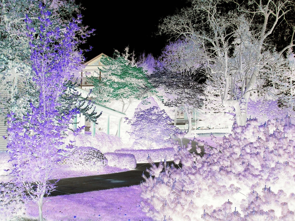
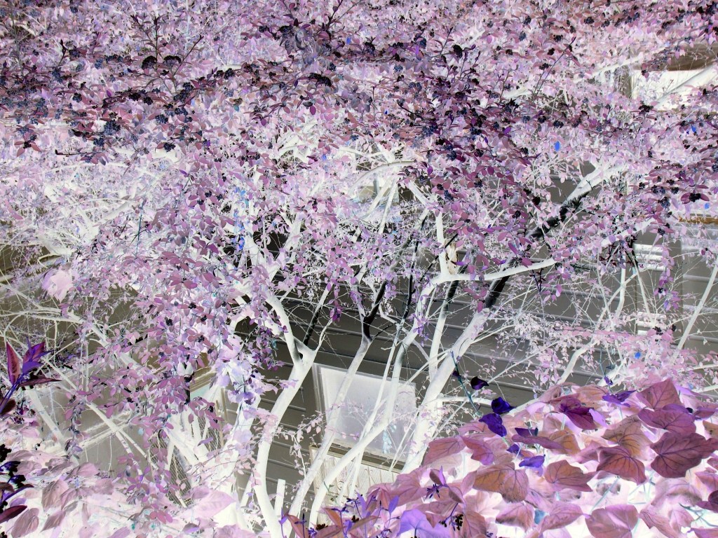
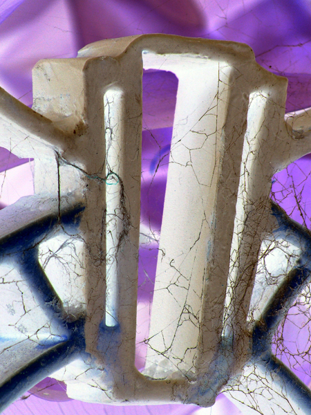
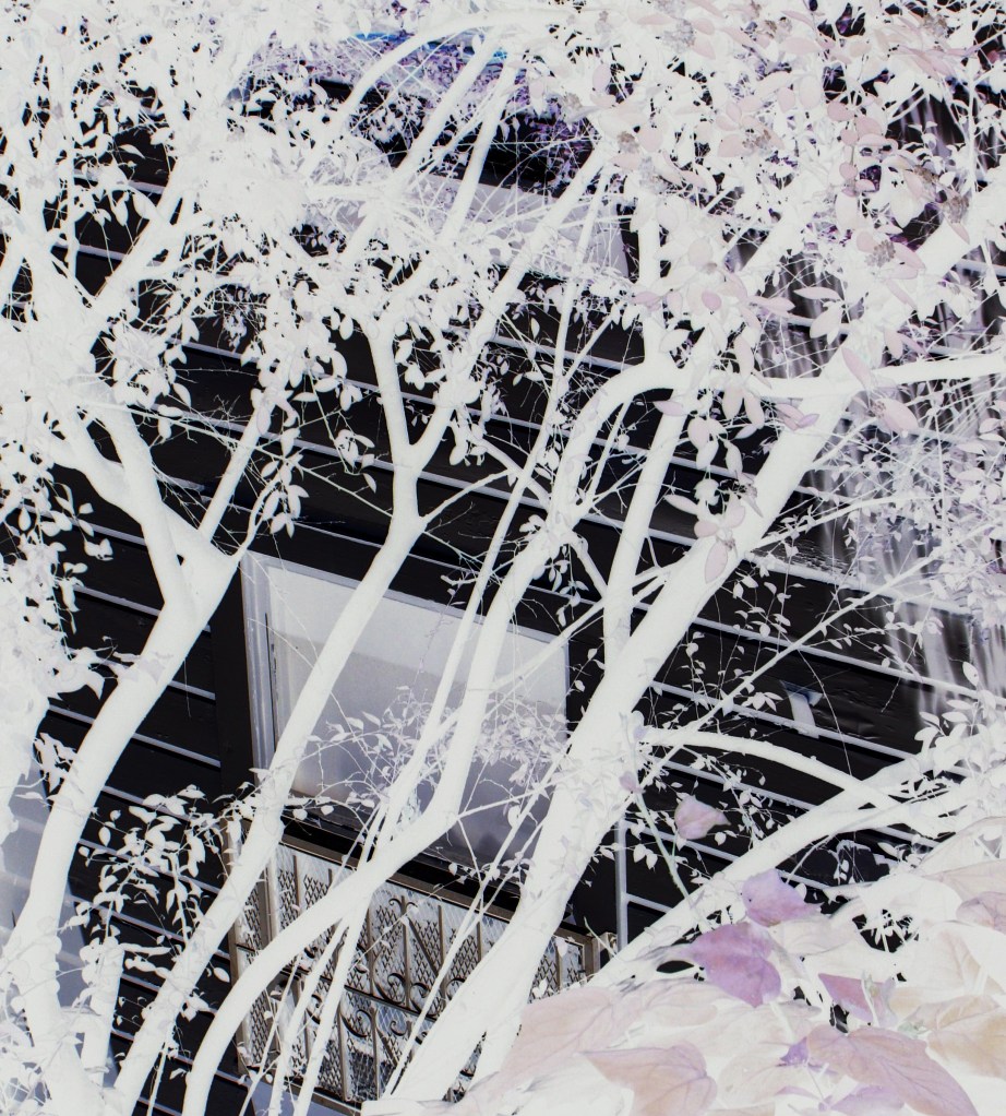
FRAGMENTS
While the preceding post describes making collages using a staining method, that is not all that was made from the sheet and a half of the marvelous Japanese Okawara paper. Those first pieces used intense color.
Here we see the process of using the Okawara fragments from those, this time leaving the beautiful creamy natural color of the paper and creating additions with fine-tip marker and acrylic.
Here is how this all evolved…..into an elegant “Sea Life”.


And still, paper remains.
NEW COLLAGE
I’ve been thinking about staining as I worked on recent paintings, but not just on canvas. Past work with my favorite Okawara paper has shown it has a wonderful affinity for that very process. (“Mind’s Eye”). As well, the idea of shaped pieces on paper has been top of mind.
So, I began working with one and a half sheets of the large sheets (about 40 x70 inches) of the natural colored Japanese Okawara paper.
The results were not expected.
The first piece is the largest, using the half sheet. The final image is a cut and shaped piece.

From remaining paper….another shaped piece.

So, there remained more fragments of the first pieces.

Next….mounting to the gessoed and painted blue fragments.

Until finally…

“LITTLE GEMS”-VARIATIONS ON A THEME
These new paintings continue the use of staining as the initial step in forming the image.
Initially intended to be a dyptich, there are now three, a tryptich.
The first, “Little Gems I”, had a slightly different surface with a first layer of absorbent ground which resulted in many more layers applied to reach the final state.
“Little Gems II” followed, both being 24 x 18 inches, as is the third, “Little Gems III”. The second canvas required thinner applications of color, the third, even less, being closest to the suggestion of the original staining.


Things did not end here, however. I decided to make use of some of my precious stash of Japanese Okawara paper to see if an interesting frottage (rubbing) could be made from the surface of the first canvas.
Prismacolor pencils are the perfect tool for discovering the subtle surface beneath the paper.

VANISHING
In line with my decision to use what I have came this painting on paper. I had a nearly full roll of drawing paper which had been rolled a very long time thus giving it a “memory” of being unforgiving to ever lie flat again.
Nevertheless I tried to make a long cut flatten by various means, resulting in two longish rectangular pieces. The first one is this one, a rather spontaneous piece in which I cast aside the idea of making a drawing, instead taking a chance with fluid acrylic regardless of usual suitability for a wet medium.
The result is a slightly bumpy but successful work. I was hoping this loose painting would “cut the cord” to the obsessive spate of dot paintings that seemed to control my work for so long. So, yes, the dots have “vanished” in any recognizable form here. Not as painful as I imagined.

VANISHING 2023 acrylic on paper 28 x 18 inches
TWO PAINTINGS
Of the two new paintings completed, this first one, titled “Slipstream”, was longest in process, though both of them were challenging. Both are 36 x 24 inches. “Slipstream” has a deeper stretcher than the second, as yet untitled painting.
Both are acrylic on canvas.


This second painting had a slightly more unusual beginning. I used a first layer of Golden Absorbent ground which generally mimics the effect of watercolor paper. This changes the way the fluid acrylic reacts on the canvas, especially when additional water is sprayed to disperse the color. However, this also causes the paint to “sink” into the surface. The result is sometimes a kind of transparency of color which may or may not be desired. So in some areas more than usual applications of paint become necessary to achieve opacity.
ART FROM ART
One of my favorite processes for making art is frottage, or rubbing. I first encountered this old process on a trip to London years ago when I visited Westminster Cathedral. It is still possible to make rubbings there of the brasses (which are actually like flat grave markers.)
The method used at Westminster involves a waxy crayon on paper over the brass which is rubbed to reveal the image of the brass beneath. Rather like using a soft pencil and paper over a coin to capture the raised image. This method is very old and has been used for recording images of old gravestones and carved stone monuments in many countries. Today people make rubbings of names on the Viet Nam Memorial in Washington, D.C.
Quite coincidentally I got a job teaching people how to make rubbings of English and Flemish replica brasses for a holiday workshop in Virginia when I returned from my visit to England. Following that, the next spring I was invited to run a shop doing the same thing in Virginia Beach.
After a while I decided to adapt the rubbing method to using my favorite drawing tool, Prismacolor pencils. And now, many years later, making images with this method and colored pencil (or sometimes even crayon) still serves me well.
Frottage was something I used often in the large body of work, “The Threads Project” (documented in this blog). Using my favorite Japanese-style paper, Okawara, it is possible to make extremely sensitive images from even tiny threads beneath the paper as seen in the Threads piece “Thermal”.

The idea of using “art from art” was also part of my thinking in The Threads Project. In “Add Color” I made first a sewn thread drawing and then using the frottage method “added color” with a thin sheet of drawing paper over the first image with the threads. So the second image is derived from the first with the addition of color. Pairs are an often-used method as well in the Project.

Returning to the art again recently I discovered that I still had some sheets of the wonderful Okawara paper. I had been “warming up” by doing small frottage drawings in my notebook. This inspired me to tackle a larger scale piece with the Okawara. I used half a sheet (they are about forty by seventy-two inches in size). The “subject” I determined would be a painting also done on Okawara and mounted to yet another sheet of it to make it more substantial and to present the image as a pair. “Ocean Gates” has a lot of surface texture which was the factor that made frottage possible.

Using Prismacolor pencils on such a large image was a big undertaking but I carried on. The linear imagery was the result of using a small bottle of gold fabric paint to draw along with Golden Fluid acrylics on “Ocean Gates”.

Again, returning to a favorite use of pairs.
SOMETHING FROM NOTHING
The late summer has been a time of re-organization, of purging uneeded things, of going through items left in the boxes and containers packed when I moved to my new place in Chicago nearly three years ago. After a long period of recuperating from several ailments and disasters I finally sense the creative flow beginning again. As in past fallow periods these are followed by times of assessing what I have to work with. The state of painting and drawing supplies, papers, and in this case, containers with many remaining pieces of cloth from The Threads Project.
In one box I came across a leftover scrap of white gauze. The larger portion was used to make a scroll-shaped piece called “Tender Threads”. It is described elsewhere in the Posts. It was composed simply of gauze and unspooled black thread.
This small remnant called out to be transformed as well. Using another larger scrap of black cotton upon which to work I used thread fragments in black, snippets of black tulle along with larger pieces of white tulle to layer the image. Returning to the use of the “stitch-mark”, the triangular stitch so often employed in The Threads Project, I fastened all together.

These random scraps could have been overlooked or discounted as having no use, but something about the gauze suggested otherwise.
I am reminded of the textile piece, “Moon, Stream, Forest” (seen in the post “Old Tradition, New Art”) which I made from scraps of cloth when I had no scissors available. I used a nail clipper to cut thread and the piece could only use the shapes of existing fabric pieces carried in a ziplock bag (result of moving back to San Franciso and waiting for possessions to be shipped.) Again, “Something from nothing.”
Following “New Threads”, I rummaged through my stores of paper. My favorite paper is, hands down, the fabulous Japanese-style Okawara. it has a smooth, glazed surface on one side and a rather rough surface on the other. Its color is a lovely neutral, creamy off white or natural color.
I have used it for many pieces over the years with fluid acrylic, colored pencil, pastel. I have even sewn it. In many ways it is like fabric but with even more possibilities. Sources for the preferred size of about 40 x 72 inches are often not as plentiful as they once were so I save every precious scrap. I took out a little box of rolled trimmings from other work, found several larger pieces to use as the foundation and began.
The strange inspiration for “Structure” was a small label that fell off some item in my household recently. I kept it, thinking there might be some odd creative use for it. The rectangular label is a much darker version of the Okawara color, yet still in the same color range. Some faded red text in Spanish is barely discernible on one side while on the other a liberal coating of glossy glue no longer functioned in its purpose.
This little label became the center and organizing element of the collage. It is what I would call an “intimate” piece; one must approach it closely to observe the very minute marks, shapes, and other elements with which it was “built”. I do think of it, for that reason, as a kind of structure, with each tiny piece chosen to work with the others. (For example, the vertical piece to the right of the label has a slight red line that echoes the nearly invisible red text on the reverse of the label.)

The diminutive size of these two pieces seems to fit the need for making work that is not overwhelming yet seems to open doors to further possibilities.
January 17, 2023~A further update-
It has just dawned on me that the three “structures” pieces have yet another referent. They were made without any conscious thought that they are actually similar to traditional patterns for quilts such as the popular Log Cabin pattern. It seems that these pieces are another example, albeit unintentional, of what my Threads Project intended, that is to blur the division between fine art and craft.
An update on October 29, 2022-
Further possibilities were realized after deciding to use some leftover pieces of my hand-dyed cotton from “The Threads Project”. With some snipping and arranging and the addition of slender pieces of commercially-dyed cotton I made two more “structure” pieces. These two are mounted to remaining pieces of black felt that I had used as a support for a series of small thread drawings. Those were then framed and exhibited at a quite large exhibition for “The Threads Project” in autumn of 2015 at The World Trade Center in Norfolk, Virginia called “Threads of Time”.
This is not the first time that I had used this particular dyed fabric. The cloth itself originated in the textile design studio I had years ago in San Francisco. In 2001 I participated in an etching workshop at the famed Crown Point Press, also in San Francisco. The work on the threads pieces was really developing at that time and working with the press and master printers helped ideas emerge.
At one point I noticed that this particular fabric really called to mind the quality of an aquatint etching. I decided to make an etching to echo the cloth and place the two same-size images side-by-side on a single sheet. The cloth was adhered using the chine colle’ process.
Using fabric and textile elements was the major theme in “The Threads Project” as I tried to blur the division between art and craft. Many such pieces came from that workshop as seen on other posts and pages on this blog.

The two new pieces are entirely cloth, using what was left of the “Rust” material and following the general idea of the paper piece “Structure”.


A NEW EDEN
New paintings which continue the stain and dot work.


MORE OF THE TRAVELER
This earlier post has been updated on March 11, 2022 to include other pieces in The Traveler series.
Grieving is a kind of journey. There is no way of knowing its length or the events that will be encountered along the way. And this journey, meant to heal the pain of loss and heartbreak, often brings a kind of amnesia. In this state of forgetfulness one can recover from terrible things that may have crushed the spirit of both the living and the dead.
That has been so since the death of my love Scott. He was a force of nature, a brilliant, ambitious man who carried a terrible burden as he made his way on his earthly journey. At last he was unable to go on and made the decision to leave us.
After more than three years time has freed me from the deepest of the sorrow. My own journey continues and now I am able to find a way to complete a kind story that finds hope and joy in thinking of Scott and about the journey he has taken since leaving us.
I have begun a series of pieces that I call “The Traveler”. There are drawings, works on paper, and paintings. This one, and each of the others, was created using a template taken from a favorite photo of Scott. In the photo he is a young man, starting out in life. He stands in front of a campus building at university, carrying his bags and looking quite serious. I like to think of him in this photo as “a man on the way up”.
This painting has a small house, an earthly home that is left behind as he moves into a new sphere of existence. I like to think of this unknown as joyful.
TRAVELER 2019 acrylic on wood panel 36 x 24 in


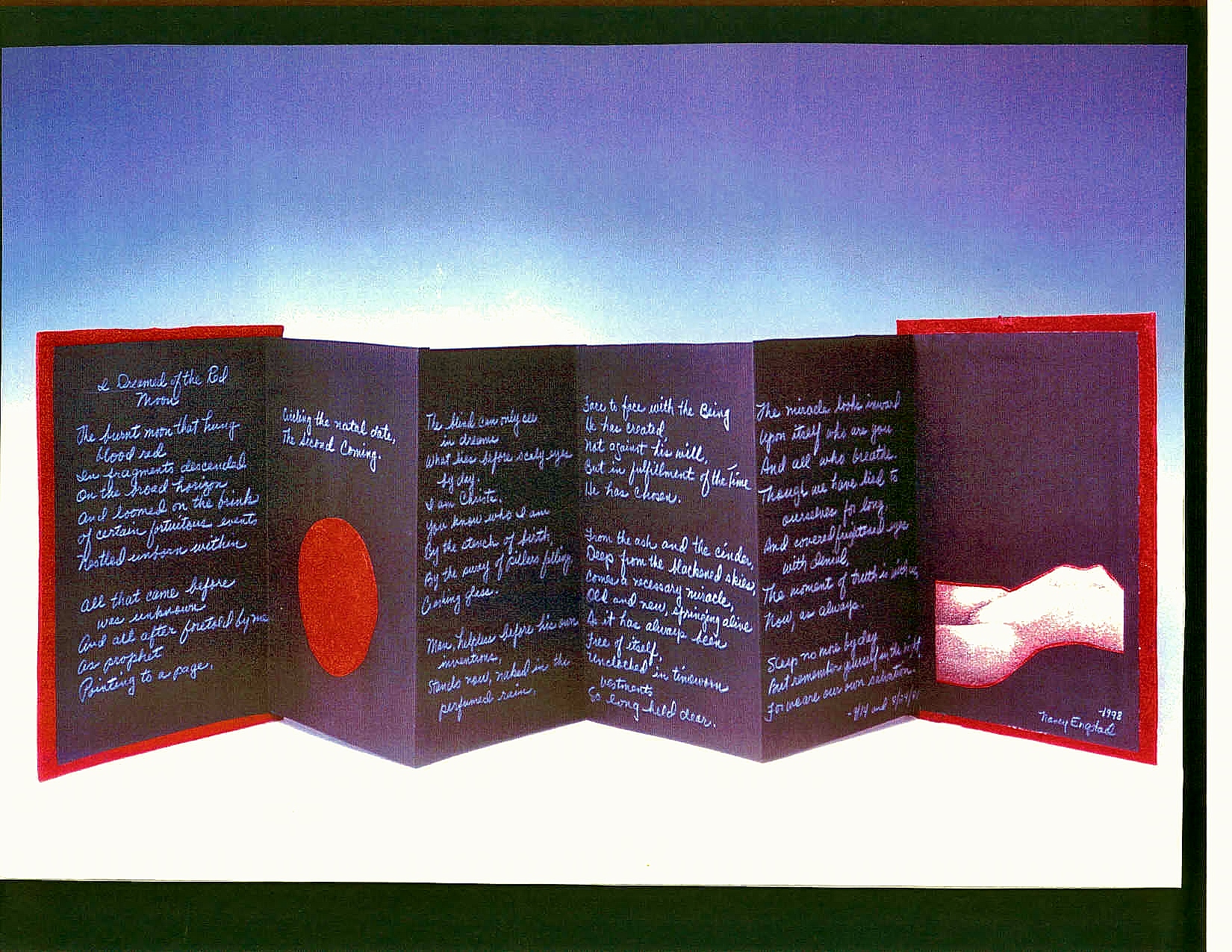
I DREAMED OF THE RED MOON

With this Post I re-visit an event which took place decades ago. It was a time when I was inhabiting a very powerful dream life, one that influenced and inspired much of my art. It was a time of earnest searching for understanding not only of the amazing events of my dream landscape but for information that exists beyond our physical time and space parameters-the metaphysical.
From sleep came this poem. It seemed to be coming from someone else, a source unknown consciously. It seemed to be “dictated” to me, and so I did my best to write what was told. The original text came on the 24th of August, 1981. I considered it finished with some minor revisions on the 14th of September, 1981. Much later, in 1992, I made a small accordion book and transcribed the poem into it and added some original art as well.
As we now witness frightening events in our world I remembered the book and its contents and have been considering the powerful words in the poem. Could this poem have relevance to the state of the world today? Have we come to the place foretold in this poem?
I DREAMED OF THE RED MOON
The burnt moon that hung blood red
In fragments descended
On the broad horizon
And loomed on the brink of certain fortuitous events
Nestled unborn within.
All that came before was unknown
And all after foretold by me
As prophet,
Pointing to a page,
Circling the natal date,
The Second Coming.
The blind can only see in dreams
What lies before scaly eyes by day.
I am Christa.
You know who I am by the stench of birth,
By the sway of pillars falling,
Crashing glass.
Man, helpless before his own inventions,
Stands now, naked in the perfumed rain,
Face to face with the Being he has created,
Not against his will,
But in fulfillment of the Time he has chosen.
From the ashes and the cinders,
Deep from the blackened skies,
Comes a necessary miracle,
Old and new, springing alive
As it has always been,
Free of itself,
Unclothed in timeworn vestments
So long held dear.
The miracle looks inward upon itself
Who are you and all who breathe.
Though we have lied to ourselves for long,
And covered frightened eyes with denial,
The moment of truth is with us,
Now, as always.
Sleep no more by day,
But remember yourself in the night,
For we are our own salvation.
-8/24/81 and 9/14/81 Norfolk, Virginia
I find it strange that, unexpectedly, I again live in the same city as when the poem was written so long ago. Am I watching the events of the poem unfold?
I DREAMED OF THE RED MOON
WORD AND IMAGE-MANY BEGINNINGS
As I am in the midst of a fallow period of making art, it seems a good time to pursue in earnest a book project that I have been thinking about for some time. It is very tentatively titled “WORD AND IMAGE”. In this book I will look at how writing or text, language, books, and book forms, intersect with my other methods of making art. I have decided to approach the book by organizing my thoughts in a series of blog posts.
As I look over years of work, I am surprised at how often the visual art and the written word are connected. And as I begin to analyze and choose the pieces to include in the book questions arise. What was the impetus for each piece? Does the work relate not only to aspects of my personal life but to the culture of the time? There is a kind of timeline which follows my life as an artist, but also, unexpectedly, as a writer as well. The book gives me the opportunity to see the larger picture of the journey as both visual artist and writer.
Some of the works I have decided to include in the book have appeared on this blog in the past, beginning with what I believe is the one of the first combining text and image, “The Male Audience”, 1980. (see “Works On Paper: A Feminist Aspect”).
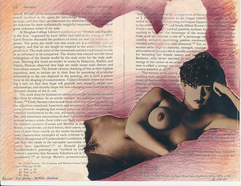
The Male Audience 1980 colored pencil, collage on paper 8.5 x 11.5 inches
THE MALE AUDIENCE 1980 Colored pencil, collage on Xerox text 8.5 x 11 inches
This piece reflects time and place in society at large and in my own personal life. I was in the midst of my last year of returning to school as a “mature” student to finish my undergraduate degree. It had to be in teaching. No studio specialty existed. It was a time of ferment, especially among female students. We were influenced and mentored by great faculty who brought to our small-town school people like Miriam Schapiro, exhibits from New York by people like the Conceptual artist Arakawa, a show of watercolors by “the” Turner, and more. It was a fortuitous gathering and an exciting environment in which we were encouraged to break out of old thinking and explore ideas that were happening in the faraway realm of “real art” in places like New York.
That year had a profound influence on my future as an artist and this influence is reflected in “The Male Audience”, created a few years later in 1980.
The text is from spirited feminist writing published in a 1975 journal about the value of women and women’s work in the arts in contemporary time as well as in history. The collaged figure is from a page in a Playboy magazine, commonly found in the Seventies and Eighties. Figures from this magazine provided me with collage and template material for figurative drawings and works on paper that expressed my feminist interests as I struggled to find my way as an artist.
The text in “The Male Audience” is meant to be read. The image of the woman calls up the male point of view, one that seems not to have changed much since the naked female picnicked among fully-clothed male artists in the famous Nineteenth-Century painting by Manet, “Dejeuner Sur L’Herbe”.
As mentioned in the earlier post on this piece, using a collaged image taken from a realistic photograph printed in Playboy serves the work better than if I had used one of my own figurative drawings. Knowing the source as a magazine that objectified the female body supports more succinctly my intention for this piece.
“MAGIC WRITING”
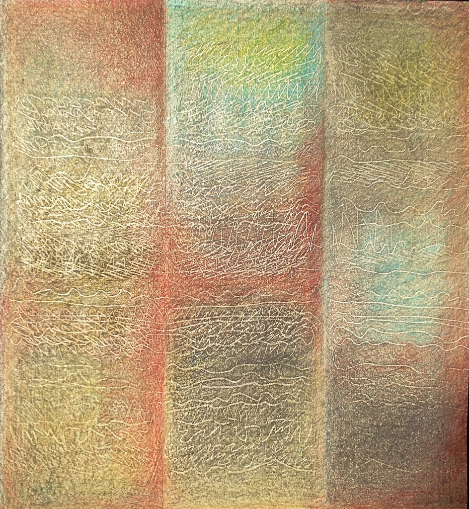
THREEFOLD 1980 colored pencil on folded paper 14 x 12 5/8 inches
A drawing which remains in my own collection is titled “Threefold”. It was done in 1980 as part of a series of folded paper pieces with impressions made by marking heavily on a separate sheet of paper on top of the intended drawing and then rubbing with soft pencil to make the lines emerge. I don’t remember the motivation to begin the series of drawings of which “Threefold” was one or why I decided to abandon figurative work. But I do remember that in childhood I was fascinated by discovering I could make “magic writing” appear by rubbing a pencil over the impression left on a sheet of paper beneath one upon which a message had been written. So perhaps that childhood experience, lodged deep in memory, forgotten even as it emerged in the art, was the inspiration for the method used in “Threefold”.
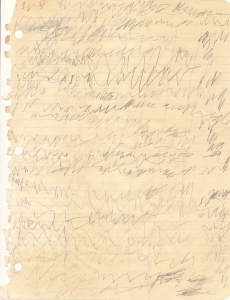
Another childhood experience, this by my four-year old son, could also be designated as having some influence in the creation of the series of “magic writing” pieces. Kevin was in the university library with me in 1974 as I studied. I gave him a notebook page and pencil so he could “write” as well.
The child’s imitative marks try to capture the act of writing but of course cannot convey a meaning. Years after making it I am amazed at how similar the marks in “Threefold” of 1980 are to the child’s “writing”. In “Threefold” the marks are intentionally meaningless. The “writing” is seen as object instead of understandable text.
Recently have I learned that “writing” or marks such as those in “Threefold” may be described as “Asemic writing”, or one with no semantic meaning. Asemic writing can span the practices of both visual art and writing. It can be done by children, as in my son’s “pretend writing”, as calligraphy, as code, or decorative marks. Perhaps we can assign the name to work by painters such as Cy Twombly or Jackson Pollack and others whose work is reminiscent of handwriting or captures the gestures of the hand in writing.
I remember also my interest in texts written in a language of which I have no understanding. To observe a Persian love poem or a lovely Chinese scroll or ancient clay tablets inscribed with a long-lost language remains mysterious and beautiful to me. A book page written in an incomprehensible language removes the words from literature to something else entirely. With no reference to meaning, what is found is simply pattern, or perhaps the illusion of secret messages. The viewer can only bring association to such images in much the same way that one would with abstract art of any kind.
As I always have considered myself a visual artist it was a great surprise to find myself beginning to write poems in the mid-Seventies. This was begun quite spontaneously and without forethought. I took that opportunity and continued to write. The writing continued for more than twenty years, up to about the time when a new challenge presented itself, what became “The Threads Project”.
A poem written in the Eighties seems now to provide some insight and a link from the writing to the visual images I was making, beginning in the late Seventies, into the Eighties. It was then that I became immersed in dreams and the metaphysical. This poem seemed to transport me to a place out of time.
“Messages”
I remember airless rooms
Where letters grow
From falling sand
As sturdy as the Pyramids.
I touch dry pages
And from ancient blood
Spring the sounds
Of sheaves long-stacked
In perpetuity.
There, on smoke-etched walls,
I see the dance,
The scripture of desire.
On faintest silk I recall
A blossom’s clear repose,
The unadorned and lucid word.
What delight is found in warm red wax,
Inviting the memory of lovers lost,
Their sweet despair.
The scent, heavy now,
And long-distilled,
Gathers in this dark-
The ashen breath of branded oaks,
The perfume of the sky.
How chaste the message of the sea.
Foamy fingers clutch at sand forever smooth.
Remember most wise scratches of the child.
They are the Myth of Innocence retold.
-1982
WHEN TIME IS FULL
We begin again,
When time is full,
Turning away
To a New Silence,
Leaving behind the old,
As the spirit slips away
From the flesh,
Having had enough of moonrise
And sunset,
Parting gracefully
From the beautiful chaos of life.
The title of this poem is “When Time Is Full”. I wrote it in 1999, about five years after the death of a dear friend. Her passing was a shock to me. Hers was the first death of someone close to me and stunned me into my first glimpse of mortality of a person my own age.
The cause of death was no surprise really. Kay was a long-time smoker and lung cancer was the result.
Sometime after her death I felt compelled to create some kind of art to express the deep emotions that I felt at her untimely passing. I was really only drawing in those days and decided to experiment with oil pastel.This piece remains as the single effort in that medium.

DEPARTURE 1994 oil pastel on paper 32.5 x 52.5 inches
The little house is meant to symbolize the earthly aspect each person has in a lifetime. At death we depart our earthly dwelling of flesh for another form of existence.
Decades have passed since the loss of my friend. Time indeed has become full for others in my life. Other dear friends have ended the journey, along with my Mother. But it is most wrenching to think about the loss of my partner Scott, my love for nearly nine years, whose “departure” came only three months ago.
It was not unexpected but it was still a great loss. Those of us left behind find a huge emptiness created by the absence of his “force of nature” personality.
I consider how to express in a work of art what his departure means and how to capture the complexities of such a complicated human being.
For now, another poem from the same year says something about the preciousness of life:
THESE BONES
Lying in some long-forgotten,
Unseen burial place,
These bones,
Fragments of some striding man
Or woman,
Now crumbled into dust
Remnants of some long-ago beauty,
Of warm flesh,
Once agile,
Inhabited by spirit,
Animated by desire-
These bones speak,
Cry out over vanished time,
Speak of a lover’s touch,
Of arms entwined in sleep
Beneath the ancient new moon.
These bones speak
Of sweet joys and bitter sorrows
And private memories,
Invisible now-
Of words once spoken
And dreams once dreamed.
These bones speak-
And we listen.
“THREADS OF TIME” EXHIBITION
The unexpected invitation by The Bureau of Cultural Affairs of Norfolk, Virginia to show a fairly comprehensive selection of work from “The Threads Project” is now on view at the Off Site Gallery in The World Trade Center. Although I was able to include only about fifty of the nearly two hundred works from that seven-year project, I was able to show some of the major pieces and illustrate some of the ideas and concepts that drove the work over those years.
Dorothy Coakley, of the Bureau, did a wonderful job hanging the show and also found the title, “Threads Of Time”. That title seems entirely appropriate to a project that evolved and developed over nearly a decade.


All photos: Eric Lusher, LusherProductions, Norfolk, Virginia 2015
THREADS OF TIME EXHIBITION
I am pleased to announce a solo exhibition of work from “The Threads Project (2001-2007)”. “Threads of Time” will open on the evening of Friday, September 18, 2015 at The World Trade Center’s Offsite Gallery in downtown Norfolk, Virginia and continue until October 16.
After showing many of the pieces from this project since its inception in 2001 in juried and solo exhibitions across the United States, I am happy to be able to have a fairly comprehensive selection of pieces on view. Visitors will be able to see approximately sixty of the several hundred works completed over the years 2001-to about 2007. Included will be textile pieces, drawings, works on paper, unique prints and works on paper derived from prints made at Crown Point Press in San Francisco, paintings, and a sculpture.
The blog covers in detail the history of “The Threads Project” and is a good resource for those planning to visit.


The Offsite Gallery is run under the auspices of The City of Norfolk through their Office of Cultural Affairs. It’s temporary gallery space is in The World Trade Center as its usual space was severely damaged by an explosion earlier this year.
This exhibition is a bit of a homecoming as I showed my work long ago in 1980 for the First Anniversary Exhibit in the original damaged gallery, The Selden Gallery in the historic Selden Arcade.
Of course I never imagined then that I would one day return to Norfolk. Some of the pieces in the exhibition have roots going back to that time. The technique of frottage or rubbing began after one of my first trips to Europe, to London, where I made tombstone rubbings at Westminster Cathedral. I enjoyed experimenting with it over time and when “The Threads Project” began several decades later it proved to be one of the important methods in my work.
“Threads of Time”~an appropriate title for a long journey.
CHILD REVISITED-A Book of Photographs
I am pleased to announce my new book of photographs, “Child Revisited”. It is a deluxe book, with images printed on high-quality paper and bound in bookcloth with beautiful dust jacket. I am very pleased that these difficult to print images have turned out so beautifully. The book is available for preview at the Blurb.com Bookstore. You will find “Child Revisited” and my other books by searching “engstad”. Enjoy!
- The photographs in “Child Revisited” document the magic of dreams, art, and the creative life. Photographed over decades, the sculpture called “Child Revisited” first symbolized the interior landsc…, April 13, 2015
- http://www.blurb.com/b/6132534-child-revisited

ORIGINS AND AFFINITIES
Part of the process of starting to make art again after a long absence is, for me, to look at earlier pieces and to go through notes and drawings.
This gives me the opportunity to look at relationships and see the development of ideas over time. It also gives me the chance to see the origins of ideas and how long before, if ever, they come to fruition in one form or another.
The two newest works on paper, as of now titled “Study One” and Study Two”, follow “Mind’s Eye”, completed at the end of 2012, which was also done on Okawara paper as these were. The idea of shaped paper seems to indicate a series in process. Looking back over earlier notes I began to see the origins of these pieces and I have included some of the notes to illustrate.
First, “Study One”~
Both use stains of fluid acrylic on Okawara paper, with gold fabric paint. This one also has been pleated as well, with the ridges highlighted with color.


.
“Study Two” also began with staining followed by my “search for pattern”, using the gold fabric paint to define. The staining process followed by the linear use of the gold closely resembles early textile work with dyes and fabrics. The Okawara paper could easily be fabric in this case. This is the “affinity” of cloth and paper that relates to earlier work.
I wondered, why the choice again of a shaped piece? I realized upon looking through notes from “The Threads Project” that there already existed ideas for such pieces. This page from 2006 shows ideas that I was working on with the “stitch-mark”, the triangular stitch used first with textile pieces and then adapted to drawings, paintings, and other works on paper.

(Over time, I’ve noted on these pages when the idea came to fruition. On this page is noted that “Stone”, a drawing in fluid acrylic on Okawara paper was completed on 12/06.)

“STONE” 2006 acrylic on Okawara paper 39.5 x 36.5 inches
There also followed a drawing on canvas with Nupastel. I wanted to answer my perennial question of “What if?”, meaning what would the idea look like in a different medium, or support, or size, for example. ( This question gave a basic methodology to “The Threads Project“.)

“SMALL STONE” 2007 Nupastel, acrylic on canvas 24 x 24 inches
The idea of pleating the paper as well as the overall surface of “Study One” made me realize again that this could well be a textile piece. And I then realized that not only was I finding my way from the earlier ideas, I was also looking forward to a new body of work for which I have been making notes for several years. Thus, the designation of these paper pieces as “Studies” is appropriate, as will be shown in future posts.
“NO CHANCE”
July 31, 2014-August 7, 2014
The 30 by 40-inch painting on canvas, “Origin”, marked the first new work this year. It was a difficult painting, laden with starts and stops and layers of decisions as I built up the surface searching for the final state.
 ORIGIN 2014 30 x 40 inches acrylic on canvas
Even as I struggled with this work, I sensed a change. Questions come to mind. Have I finished with this series of dot and stain pieces? If not, where am I going? And significantly, what connections are there to my past work and to contemporary art being created today?
As I mentioned recently, the creative well has been severely depleted. So it is wonderful to be working at all. As in past times of such depletion, I am slowly emerging from the anaesthesia. I am looking at art again, art of all kinds. I am looking at what is happening in the capitals such as London where The Tate Gallery is of course in the forefront of exciting contemporary art. A link from The Tate’s website to the iconic institution WhiteChapel Gallery has led me to their series of anthologies,Documents of Contemporary Art . Historic and contemporary aesthetic ideas and issues are written about by artists, curators, and scholars.
My first two choices in the series are “Time”, edited by Amelia Groom, and “Chance”, edited by Margaret Iverson.
I chose the volume devoted to “Chance” because I had been thinking about the switch about a decade ago from work that was primarily figurative to non-representational work or abstract. I had been thinking of conversations with a colleague who was struggling with her first attempts at abstract painting. I offered the advice to “search for the pattern” in the marks already made in her painting. This led me to analyze my own process, particularly in the ongoing series of stain/dot paintings. I had been thinking of the staining aspect in terms of “chance” and was considering a blog post on this process about a year ago. My tentative title, “The Game of Chance And The Search For Pattern” now seems flawed, at least in reference to my own work.
Rather than chance, especially in this recent piece, perhaps accretion would better describe the process.
The origin of the staining method began with the textile work decades ago. The application of fluid color onto the stretched canvas, a fabric after all, causes a similar result as my old dye processes on silk and cotton. There is a slight sense that the stain begins with no authority of mine, But that’s where any possibility of chance ends. By tipping, blotting, spraying, I guide the flow of color as much as possible. I search for a pattern, yes, but one that fit my sense of composition on the surface.
 These photos give a bit of of the steps in the process of trying to work out this painting. As the top photo shows, it as a difficult process, with attempts covered over.
At some points, it seemed the solution was in hand. But no, the painting was far from the final state. I was tempted to resist the usual complexities of the dots, to leave the composition in a far more spare state of positive and negative.
 But there seemed to be in irresistable force at work. I felt driven to continue finding “islands” of color and dots in the field of the canvas.
 This photo gives the “terrain” of the painting. From these “islands” developed the pattern that also sustained the stains from which the picture began.
Here are details of the finished painting~

 The process of naming this painting was just as difficult as making it. I really searched my associations for a title which would not be trite or overly suggestive and narrow. In the end, a television program on until now unseen formation of stars gave an idea. Photographs beamed from distant space showed what astronomers called a “natal environment”, a place where a new star might be born. This painting was actually a beginning in a sense. It did record, in the process of its making, the state of chaos that precedes solution or manifestation. So rather than the rather unpoetic “natal environment”, the title “Origin” seemed appropriate.
In answer to my question of whether these dot and stain paintings have come to an end, the answer is no. The blank canvases await.
SUMMER INTRODUCTIONS
This new post comes after a long hiatus indeed. Leaving the West Coast for the East, a long renovation on a new home, all conspired to keep me away from my blog activities.
I’ve returned to Virginia after leaving in 1983 for San Francisco. Norfolk was my home from 1977 to 1983. I am happy to mark my return with an exhibition at The Art Works Gallery, sharing the exhibition with Lawrence (Skip) Hollingsworth, a painter, and Zach McKiernan, an historian who brought the work of a collective of printmakers from Chile.


I chose to hang a selection of works from “The Threads Project”, a large body of work which has been extensively documented in this blog. This project marked a great change from the primarily figurative work that I was making in the years I lived in Virginia and has informed the work which evolved and developed since.
The pieces in the exhibition were selected to illustrate important ideas from “The Threads Project” such as pairs and analogies, “lab pieces”, thread drawing, the “stitch-mark”, and using thread as both subject and medium, all of which may be read about in this blog’s Posts and Pages. Among the works were pieces which have been previously exhibited such as two triptychs, “Three In Red” and “Elements”. Works chosen included paintings, works on paper such as the announcement piece “Pages II (Red)”, and textile pieces.
Also included was “Mind’s Eye”, one of my most recent works. This is a work on paper which is descended from the ideas and relationships in “The Threads Project” that link my fine art to my textile work. I used fluid acrylic in a kind of staining method on paper much in the way that I once used dyes on fabric.

MIND’S EYE 2012
Acrylic/Okawara paper
Approx. 35″ diameter
SILK, PAPER, AND CANVAS~MATERIAL MATTERS
After more than three years, I have updated the Page which previously was titled “Textile Design Notes and Gallery” is now PROCESS AND MATERIALITY~PAINTING AND DYEING.
The new Page illustrates my wish to dissolve boundaries between materials and processes, to broaden the ideas of what defines art as artists, “craftspeople”, designers, and Makers of all creative bents continue to show in the Twenty-First Century.
 GEMSTONE dyed silk c.1997
 “Gemstone” is one of the first textiles which I considered as a unique work of art.
 ARCHIPELAGO 2012 Acrylic on Okawara paper
The newly-updated Page has links to Posts which show the evolution of early textile work to recent acrylic paintings on paper and canvas.
NORTHERN ILLINOIS UNIVERSITY ART MUSEUM EXHIBITION
“OJECTIVE/SUBJECTIVE: MAPPING AS VISUAL LANGUAGE”, the two-part exhibition at NIU’s Art Museum in DeKalb, Illinois has opened. This will continue to May 24, 2013.

Included is my 2005 work on paper, from the folded suite of four, “Four Maps For Karibib: Interior Landscape”. This was exhibited in Karibib, Namibia in 2005.
 FOUR MAPS FOR KARIBIB-INTERIOR LANDSCAPE 2005 Acrylic, thread on Okawara paper
The museum announcement describes the exhibitions:
“Contemporary artists utilize the visual and conceptual language of mapping to respond to both real and imagines spaces. Artists included: Erin Coleman-Cruz, Nancy Engstad, Adam Benjamin Fung, Ilana Halperin, Donna Katz, Ray Klimek, Dan Miller, Dan Mills, Ben Rosecrans, Ken’ichiro Taniguchi, and William Walmsley.”
A parallel exhibition, “MAPPING: MEASURING ACROSS PLACE AND PERIOD, INFORMATION, NAVIGATION AND GEOGRAPHY” opened on April 4 and continues as well to May 24.
“Focuses on the utility and aesthetics of ancient and modern maps and explores contemporary artistic interpretation of maps and mapping devices. This exhibition is organized by the Art 656 Museum Exhibition and Interpretations graduate students enrolled in the NIU Certificate for Museum Studies.”
The museum also describes their mission:
As an art museum belonging to an academic institution, the dual roles of NIU Art Museum are to contribute significantly to the university’s educational curriculum, and to provide opportunities for art education and cultural enrichment to the people of the northern Illinois community. The Museum serves to educate, preserve, exhibit and enlighten by balancing the challenges of contemporary art with the riches of traditional media for comprehensive examination of visual culture.”
The museum has an impressive calendar of events in conjunction with the Mapping Suite Exhibition, including gallery talks and workshops. Also scheduled are an informal talk by George and Mary Ritzlin, dealers in antique maps, talks by Gerald Brauer, an art historian and map collector, and programs by James R. Ackerman, Curator of the University’s Hermon Dunlap Smith Center for the History of Cartography, Newberry Library, and Diane Dillion, Director of the Scholarly and Undergradute Programs, also of the Newberry Library.
Workshops provide events and activities for both children and adults, fulfilling the museum’s mission to focus on the educational opportunities of the exhibitions. Included are “Mapping: An Artmaking Adventure”, a three-day workshop for 9-12 year-olds.
“Aimless Wandering: The Theory and Practice of Getting Lost” is a workshop for adults with Karen Brown and Sarah Evans of the university faculty.
Peter Olson, co-curator with Heather Green, sent along a link of Flickr photos of the exhibition: http://www.flickr.com/photos/niuartmuseum/sets/72157633209120291/
It is an impressive curatorial effort and an amazing collaborative effort with the university’s faculty, libraries, and staff.
I am pleased to be included in this intellectually and aesthetically challenging exhibition. Each of the artists brought another dimension to viewers. The perception and definitions of “maps” and “mapping” was most certainly expanded by the work presented.
TERMITES AND MOLTEN GOLD
Painting is back in my life after a rough patch. I have finished two paintings that remained unresolved, one for more than five years, and the other since last May.
My trip to Namibia in late 2005 resulted in so many memorable experiences and images. One of these was the abundance of amazing termite hills. Inspired by the landscape of this sparsely-populated desert country I thought to do a series of work both in textiles and painting. But alas, this tall, vertical painting sat unfinished and unsatisfying until now. The impetus to start again came from the last image posted, “Mind’s Eye”. This employed gold acrylic in two forms on my beloved Okawara paper. The more liquid of the two media happened to be Jacquard’s Lumiere, a paint I have used to great purpose in my textile work. I discovered that it worked beautifully on not only paper, but the rough and textured surface of the painting. I went on to pick up the last of my 30 x 30 inch canvases left unattended for months. Risking overkill, I discovered that Lumiere lends itself to subtle layering with fluid acrylics as well as various mediums.
Here are the results~

NOON: APEX 2013 Acrylic on canvas 48 x 24″ Private Collection

MOLTEN 2013 Acrylic on canvas 30 x 30″
Although I didn’t make the connection while working on “Molten”, there certainly is a flavor of the textures and light of the desert observed in Namibia. Looking back, I found some of the photos taken there provide a visual memory of the dramatic landscape more than eleven thousand miles from California.

Long Shadows At Apex Farm

Shed Snakeskin-Apex Farm

Termite Hill At Apex Farm
Kurt, Carolla, and grandson were my hosts at their forty-five acre game farm. Carolla and I participated in the first invitational, international art exhibition, Art Action-Seven Fires in Karibib in August of 2005.
As mentioned in earlier posts, one of the pieces exhibited there, from a suite of four works on paper, will now appear in an exhibition at Northern Illinois University’s Museum of Art at DeKalb. The exhibit, called “OBJECTIVE / SUBJECTIVE: Mapping as Visual Language” will show the work of ten artists from March 19 through May 24, 2013.
These works echoed the landscapes of not only the as yet-unseen country in which they were to be exhibited, but a landscape of the mind and imagination sparked by the materiality and process of paint on paper. I carried the four pieces folded into a pocket on the side of my luggage and they were hung in a stone building with clear plastic clips. The same system will display “Interior Landscape” at the museum exhibition.
FOUR MAPS FOR KARIBIB-INTERIOR LANDSCAPE 2005 Acrylic, thread on Okawara paper
WEEKLY CHALLENGE~”DELICATE” II
The process of inverting digital photographs actually started when I was involved in working on my “Threads Project”. The amazing transformation of my digital “thread drawings” inspired me to use this process on some of photos and has indeed led to quite a body of work.
I have used the inversion process on photos taken on travels, such as to Paris. These photos resulted in a book ” The Other Side Of Paris” and “Sunlight And Shadow”, photos of the grounds of The de Young Museum in San Francisco. But I began some of the outdoor images back when I lived in the little town of Pawcatuck, Connecticut, which lies on the opposite side of a river and the Rhode Island town of Westerly. There I found a beautiful park designed by Olmstead, the same man who designed Central Park in New York City. My first printed inverted image came from these photos and are as delicate as watercolor.
WILCOX PARK
Westerly, Rhode Island
But one of my favorite ongoing sites to snap photos suitable for the inversion process is, as mentioned in the last post, right outside my windows. Here are others from that vantage as well as one nearby.
From THE PATIO Series
GARDEN WEB
2010
From The Patio Series
The effect of the the time of day can be seen on the second version from The Patio Series. The image became nearly monochromatic as the sun slid behind the buildings. This view looks down into a small garden area between my building and my neighbor’s. The only manipulation of the photos is the inversion process which is very direct.More images related to this post can be seen in Pages and Posts on “The Threads Project”as well as those relating to the subject of inverted photographs and the books published at Blurb.com.
“MIND’S EYE”
Sometimes ideas float around for quite a while before the opportunity or impetus for acting on it comes along.
While doing some websearching for exhibition opportunities I came across one for a gallery in London. The timeline was short but the topic was intriguing~”Gold”. A “match” came to mind, the thumbnail from some time back for the shaped drawing for which I already had the title in mind, “Mind’s Eye”. I would use a simple but dramatic palette of black and metallic gold.
Using the familiar and favored Okawara paper, I decided to use a roughly roundish shape with the staining process of recent work. But the addition of gold to the mix caused me to consider my options. I decided to use a metallic acrylic with a thicker, adhesive quality normally used on fabric but perfectly at home on paper. Although it came with a tip that allowed me to “draw” lines with the paint, I used a brush as well.
This is the result~A second work with the same palette on Okawara is in progress.
MIND’S EYE 2012
Acrylic/Okawara paper
Approx. 35″ diameter
“MAPPING”~SPRING 2013 EXHIBITION
A BIT OF GOOD NEWS THIS WEEK~”Four Maps For Karibib-Interior” has been selected to be included in the spring exhibition “Mapping” at Northern Illinois University, DeKalb, Illinois. The exhibition will take place March 19 to May 24, 2013.
This piece is one of four in a suite titled “Four Maps For Karibib”. They were created in 2005 on the occasion of an invitation to exhibit for the first international exhibition in the town of Karibib, located a few hours from the capital of Nambia, Windhoek. Nambibia is a sparsely-populated country just west of South Africa. With an land area twice the size of California but with less than two million people, this exhibition was a big event to its citizens. A German colony until the early Twentieth Century, then aligned with South Africa, Namibia is now an independant republic since 1990. It is still a rough and tumble place that attracts people from many countries. Our exhibition was held at a compound in Karibib owned by a Russian ex-pat Leonid Stupenkov. The event was not only an opportunity to show work of artists but a celebration that included bonfires, fireworks, roasted goat, music and dancing. It was truly an international event! In attendance were members of the media, including radio and newspaper, as well as the Russian consul and his wife. Some traveled, I was told, two hundred kilometers to join the festivities.

Four Maps For Karibib-Interior 2005 Acrylic, thread on Okwara paper
I wrote about the exhibition in an earlier Page on Webs And Threads. Here is a partial excerpt:
“ART ACTION-SEVEN FIRES” ~NAMIBIA 2005
I received an unexpected email one day in June, 2005, inviting me to exhibit my art in Namibia where a dear old friend, Armand has lived for many years. We met in Virginia in 1979 as he was ending a long journey across America and Canada. He was about to return home to Nuremberg, Germany to continue his studies in architectural restoration and art.
Although we knew each other just a short time, it seemed like the right thing to do when I accepted his family’s invitation to visit Germany for a Bavarian Christmas and what was to be my first trip to Europe. It was to be one of the most wonderful experiences of my life. We have all stayed in touch since then, in spite of far-flung locations and busy lives.
Armand’s adventurous spirit took him to Africa, where he finally settled in Namibia in the small town of Karibib. There he has worked as a sculptor as well as created amazing mosaics and stonework. Although the digital age means that we now stay in touch more often, the email invitation came out of the blue!. After all the years of thinking about a visit to Africa, the time was right!
There were only a few weeks to prepare my work for the exhibition. I came up with the idea of folded works on paper when I noticed a folded map of California. This turned out to be the ideal solution to transporting art more than eleven thousand miles.
I simply folded the suite of four “Maps For Karibib” and put them into the zippered side pocket of my luggage. On arrival and the installation of our work, Armand strung a stainless steel wire in the stone building where our work was located. I use stainless steel spring clips to hang them like laundry. The beautiful Okawara paper did resemble fabric and visitors enjoyed walking around to see both sides of the four works.
The four works utilize the triangular “the stitch-mark” motif first developed as part of THE THREADS PROJECT.

